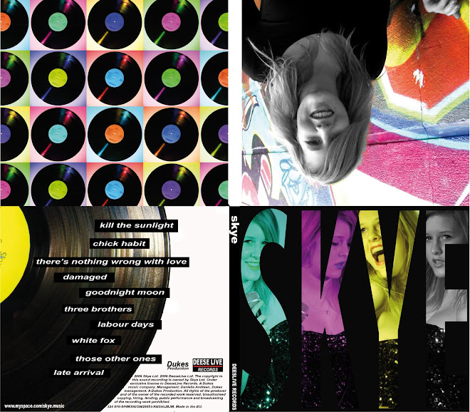
Album Cover ConventionsTypical Features- Cover Art
- Album Title
- Band Name
- Track List
- Brand Style - Band/Label
- Label
- Legal/Institution Information
- Barcode
- Stickers - Review/Features/Price Deal/No1 Album?
- Parental Guides?
- Band Members/Producers = Credits
Categories- Cover Art - Art/Photography/Design/Mixed
- Cover Subject - Band(or Artist)/Design/Other Subject (Photo/Art of something. i.e. Prodigy Crab)
- Genre - Follow Genre conventions
- Target Audience - Tied in with Genre
- Release Date - In fashion of time
Purpose- Band image/identity - Brand promotion
- Show information
- Stand out on shelves
- Make genre clear
The Beatles - Revolver (1966)
Revolver was the seventh album released by The Beatles, and was the first studio only album released. The Beatles by now where a well established band and where superstars on both sides of the Atlantic. However they where up till this point a pop band, and this album marks the begining of the change in scene and brand for The Beatles. From Revolver The Beatles moved into a more rock and psychadelic music genre, and changed their image from young pop lads to older more mature rock band. The focus moved to the music and they stopped touring.
This album cover was really used to staple this and demonstrate it to the fans...
The cover features an art piece which uses illustration and photography put together in a collage, with pen and ink stlye drawings by artist Klaus Voorman, which uses only the faces of The Beatles themselves and does not even feature the band name, instead only the ablum title. This is due to the fact that they where already such a brand themselves. The style is artistic and the entire colour scheme only consists of black and white, this is perhaps to conote an indy, arty style. The style really moves away from their previous, pop orientated style. The reason this is so obvious is due to the huge ommission of having a large band photograph, which until Revolver had been the on going style/brand through The Beatles. The reverse of the album features a black and white photo of the band recording, again tying in with the black and white style of the front, and with the focus on studio recording and the music, which was evolving quite drastically for this album. The last thing to note about this album cover is that all the written information, is in plain, simple black font. I think this is tying in with the simplicity of the album style, and the image it is working to convey, of a mature band.
I think that the Revolver album cover is not only a very good album cover, but is also an iconic album cover. I think the style is refined and the cover is a very good piece of design/illustration.

 (click for full)


.jpg)
