Wednesday, January 27, 2010
Thursday, December 17, 2009
Evaluation Q4
Evaluation Q3
In this question my role was to discuss and build on points made by my group, as I was not 'chairing' the question but I did have to be part of the answer. I think that I did participate sufficiently and I did say a good balance of saying new points and building on points made.
I think that our group covered all the necessary aspects of the question and we definitely discussed everything to enough depth. We also said our opinions at various points which I thinik is definitely essential to the evaluation.
Evaluation Q2
In this question my role was to contribute to discussion, and try to build upon points made and add my own ideas and views. As a group we wanted to discuss the effctiveness of our brand and how we brought the platforms together to work in synergy. We wanted to discuss how we had created a brand for our artist.
Evaluation Q1
In this question we all prepared to talk about one aspect of our project each, I was given the album cover to talk about and so for this part of the question I opened discussion and introduced some ideas. The following video shows the album cover section of question 1, however the rest of the question was still covered by my group. The full version is on the Group Blog.
In question 1 we discussed all the media products we created and how the challenge or follow convention, we all discussed equally and and presented ideas as a group and as individuals. I feel like I was able to develop technically often and with the section on the album cover which I opened I feel that I was definately able to go deeper and try to present some personal ideas. I was able to talk in depth about what we did with the cover and why. I think that we covered everything that was necessary to be covered and I feel like everyone spoke their fair share throughout what was the longest question.
In this clip we reference some album covers and these are those covers...
Tuesday, December 8, 2009
Audience Feedback
1. Everybody we asked said the video looked proffessional.
Reasons why being things such as the changing clothes, effects, the fact there was so much going on, it was eye catching, that is was quirky and fun, and that there where bright colours.
3. Videos mention where actually some of the videos we referenced such as...
- Kesha - Tick Tock
- Duffy - Warwick Avenue
We feel like this is good because it shows perhaps that our video almost stands beside these videos.
4. The audiences understood the concepts behind our video and they seemed to appreciate that it was made up of concept and performance. Some of the themes written where: lost love, break up, London, femeninity, youth, independence and fun.
5. The genre was conveyed perfectly as our feedback all knew it was a pop song, with some even writing retro/alternative pop which is our exact genre.
6. Words used to describe Skye as an artist were quirky, likeable, young, pretty, individual, appealing, fun to watch, original, fashionable, flirty/sexy. This shows that they saw the sides of Skye we aimed to convey.
7. Channels written that our audience think our video would appear on include 4music, MTV, The Box, TMF, The Hits, MTV hits, NME, Q
8. Magazines written that our audience think our video would appear on include Time Out, Smash hits, mainstream music, NME, Glamour
9. When asked if they wanted to watch it several times over 74% said yes, 10% said no, 16% said maybe. These are definately positive results
10. About half of our audience said they would spend money to download the single
11. Favourite moments included the clothes changing, the split screens, the end shots, a lot of people liked the reaction shots, and loads of people loved it when Skye danced with the random guy.
12. We were given a few criticisms aswell:
- out of sync
- changes between black and white to colour where too sudden
- the audience wanted more retro clothes
- they wanted more reactions and random people
- one person did not like what the colour alterations did to our artists lips on the cover (probably not enough people pickedup on this to make it a real issue)
13. The whole audience feedback group felt that all the platforms came together and worked well to create an artist brandy. They thought it was glamarous, looked proffesional and most said the album cover was very good.
The feedback given really illustrates how much of a success our video has been, I think we caught a good balance in our video and I think that it manages to maintain the audiences interest throughout. I am happy with the feedback given.
Saturday, December 5, 2009
Audience Questionnaire
1) Does the video look like a music video? - if so in what way?
2) Does it entertain you? - if so how
3) What other music videos would you compare it to?
4) Can you describe the narrative, theme or concept of the video?
5) What is the genre of this music video?
6) Can you tell us anything about the identity of the artist AND do you find her appealing?…if so, why?
7) Which music channel would you expect to see this playing on?
8) Which music magazine might it be reviewed in?
9) Would you want to watch it several times over?
10) Would you be willing to spend money to download this single?
11) What was your favourite moment in the video
12) Do you have any criticisms? – (be honest)
13) Do you like the look of the Album cover and Myspace? – do they fit with the video?
Saturday, November 28, 2009
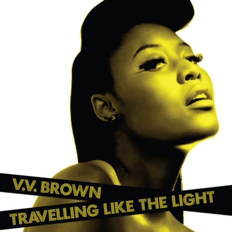
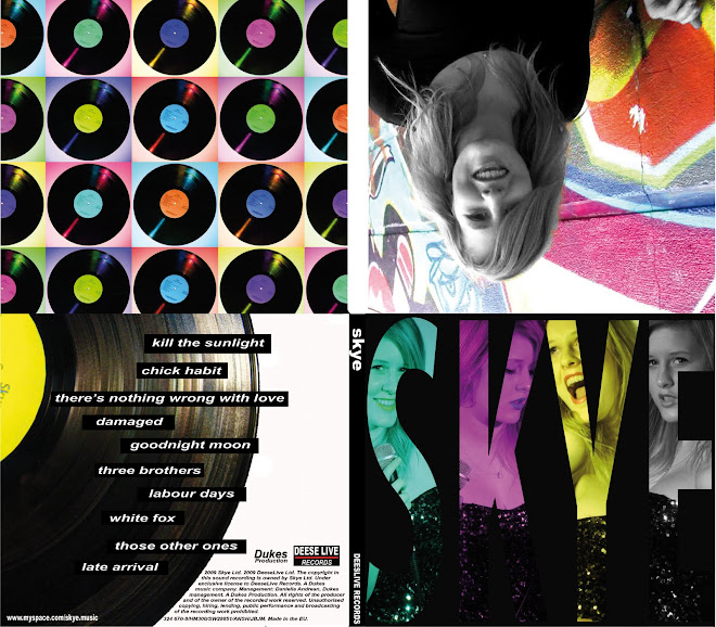
Album Cover
Friday, November 27, 2009
Deadline
We are signing off...
- the music video
- the album cover
- the myspace
Basically the whole artist package.
We need to be signed off by 4oclock by Ms Blackborow and I think that it is possible for our group to do what is necessary.
Wednesday, November 18, 2009
Branding Skye
Friday, November 6, 2009
Album Cover references
Wednesday, November 4, 2009
Album Cover Analysis
Typical Features
- Cover Art
- Album Title
- Band Name
- Track List
- Brand Style - Band/Label
- Label
- Legal/Institution Information
- Barcode
- Stickers - Review/Features/Price Deal/No1 Album?
- Parental Guides?
- Band Members/Producers = Credits
- Cover Art - Art/Photography/Design/Mixed
- Cover Subject - Band(or Artist)/Design/Other Subject (Photo/Art of something. i.e. Prodigy Crab)
- Genre - Follow Genre conventions
- Target Audience - Tied in with Genre
- Release Date - In fashion of time
- Band image/identity - Brand promotion
- Show information
- Stand out on shelves
- Make genre clear
Revolver was the seventh album released by The Beatles, and was the first studio only album released. The Beatles by now where a well established band and where superstars on both sides of the Atlantic. However they where up till this point a pop band, and this album marks the begining of the change in scene and brand for The Beatles. From Revolver The Beatles moved into a more rock and psychadelic music genre, and changed their image from young pop lads to older more mature rock band. The focus moved to the music and they stopped touring.
This album cover was really used to staple this and demonstrate it to the fans...
The cover features an art piece which uses illustration and photography put together in a collage, with pen and ink stlye drawings by artist Klaus Voorman, which uses only the faces of The Beatles themselves and does not even feature the band name, instead only the ablum title. This is due to the fact that they where already such a brand themselves. The style is artistic and the entire colour scheme only consists of black and white, this is perhaps to conote an indy, arty style. The style really moves away from their previous, pop orientated style. The reason this is so obvious is due to the huge ommission of having a large band photograph, which until Revolver had been the on going style/brand through The Beatles. The reverse of the album features a black and white photo of the band recording, again tying in with the black and white style of the front, and with the focus on studio recording and the music, which was evolving quite drastically for this album. The last thing to note about this album cover is that all the written information, is in plain, simple black font. I think this is tying in with the simplicity of the album style, and the image it is working to convey, of a mature band.
I think that the Revolver album cover is not only a very good album cover, but is also an iconic album cover. I think the style is refined and the cover is a very good piece of design/illustration.
Tuesday, October 27, 2009
Thursday, October 22, 2009
Project Progress
-We have finally got together a storyboard - Its taken a while, but we have planned out what we need to shoot and what shots are important. We have come up with 3 shot categories - Performance on location, performance in studio and interaction on location. This splits our shoots into outdoor shoots and studio shoots for convenience. We also have decided we want every location to be shot in long, medium and close shots; we need this contrast to keep our audience interested, as we do not have as much substance in terms of narrative (we have some but by no means is it the focal point of our video). We also plan to experiment with camerawork on location, we hope for some spontinuity on our shoot.
- Planned a location recce - Sunday 18th - We want to scout the areas where we want to shoot, to plan the quickest route on shoot days, and to get a feel for our surroundings. The plan is to waste time on the recce so we do not have to on the shoots, we dont want to waste our actresses time.
Thursday, October 15, 2009
Song Choice
April March - Chick Habit
hang up the chick habit
hang it up, daddy,
or you'll be alone in a quick
hang up the chick habit
hang it up, daddy,
or you'll never get another fix
i'm telling you it's not a trick
pay attention, don't be thick
or you're liable to get licked
you're gonna see the reason why
when they're spitting in your eye
they'll be spitting in your eye
hang up the chick habit
hang it up, daddy,
a girl's not a tonic or a pill
hang up the chick habit
hang it up, daddy,
you're just jonesing for a spill
oh, how your bubble's gonna burst
when you meet another nurse
she'll be driving in a hearse
you're gonna need a heap of glue
when they all catch up with you
and they cut you up in two
now your ears are ringing
the birds have stopped their singing
everything is turning grey
no candy in your till
no cutie left to thrill
you're alone on a tuesday
hang up the chick habit
hang it up, daddy,
or you'll be alone in a quick
hang up the chick habit
hang it up, daddy,
or you'll never get another fix
i'm telling you it's not a trick
pay attention, don't be thick
or you're liable to get licked
you're gonna see the reason why
when they're spitting in your eye
they'll be spitting in your eye
Monday, October 12, 2009
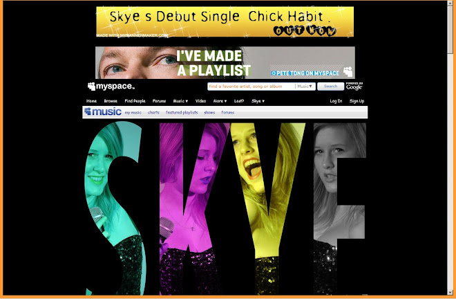
Myspace Analysis
http://www.myspace.com/lilymusic
La Roux is a relatively new aternative/electro female singer/musician, who has quickly grown popular on the back of a few pop singles, released earlier this year. Her space is full of lots of very flashy banners and applications, with built in videos and posters. She uses a bright, neon style, almost cabaret inspired layout and font, on a plain black background. This is in an attempt to seem edgy and unique. She doesnt want to seem as shallow as a pop artist, but does not want to alienate the pop audiences.
Aside from this the space doesnt seem too personal to her fans, its really an info site, and doesnt look like she really put it together or has much input on a regular basis. I think this may be as a result of her coming up in a very mainstream way, through a major label contractl; rather than a band like Arctic Monkeys or Lily Allen, Whos myspace would have been pivotal for their music careers, and who therefore have a much larger input into their spaces, and more contact with fans through it.
Arctic Monkeys
http://www.myspace.com/arcticmonkeys
Wednesday, October 7, 2009
Song Ideas
April March - Chick Habit
I came across this song when watching the Quentin Tarantino film Death Proof. I thought it worked really well with the film and is a song that can work with our project. The tempo and melody of the song is something which I think would work with a fast paced and fun music video. The song is about girls getting back at boys, and I think that our video would have to feature a female lead actress.
Babe Ruth - The Mexican
I heard this song in a long mash-up, so I checked what it was called and found the original. Its a song which I really like and I can see it having an epic (for lack of a better word) music video. I see it having a neo-western video, paying homage to Sergio Leone films in a modern fresh way, and having a strongly narrative based film. The song is an interesting style, and is a long way from modern pop, so I think that the synergy of old and new could be interesting. This is a video which I can see with lots of actors/actresses.
Shivaree - Goodnight moon
This is a mellow song, which I think is not only a good song, but also leaves us with a chance to really make the video we want for it. I think this is a video which can be abstract and still work with the song. I can also see it working well with a narrative video. Whether we choose this, and use narrative or concept, I think that the style of the song lends itself to a video which is arty and conceptually filmed and editied. That is something I want to do, and is something which definately makes this song an option for me.
Thursday, October 1, 2009
4Ps
a) What band/artist related products can audiences buy?
You can purchase their music, in Audio or Video form, from CD to DVD to Record to BluRay. Online content is also growing as bands allow more and more sharing of content online.
b) Where can audiences buy/listen to music/merchandise/hardware?
Listening is really possible anywhere and is down to audience discretion, and this includes live and non live listening. Audiences can buy the music at high street retailers, and online. there are really so many options of where to buy it online or off. Other free options include radio and myspace.
c) Give 2 or 3 examples of paid-for/subscription based and free products.
- Spotify 9.99 a month for no ads
- Itunes pay as you buy rather than subscription
- Illegal torrents and filesharing such as limewire
d) List examples of creative music marketing strategies (including at least 3 internet based examples).
The Streets: a crop circle was made of Mike Skinners face to promote the new album. He also gave away free songs to his fans via Twitter.
2. Who is frukt uk and what is their mission statement/company ethos
Frukt UK are a music marketing agency. They create and develop ideas that use music as a means of marketing.
Mission Statement:
“We’re all about music and are really very fond of it. Music colours people’s everyday lives…We help brands access the passion and the communities, the lifestyle and the artists.”
Monday, September 28, 2009
DYM MARKETING FEEDBACK
The Streets

The Streets was originally an underground UK Garage/HipHop group made up of 4 members. Originally the group set out to push the UK garage/hip hop scene in a new direction, and made a relatively quick rise to fame with their critically acclaimed debut 'Original Pirate Material'. However following the release of this album the group split leaving only Mike Skinner, as a solo artist. Skinner held on to The Streets name and has continued making music to date. The music has slowly developed into a more mainstream style and has become less garage, however The Streets still recieve much critical acclaim.
2) Who are the fans? Do you have any sense of how the music companies have segmented the audiences? To what extent has the branding of a band been linked to target audience?
The core audience of The Streets was originally young working class males, this is probably due to the garage genre, and due to their ability to connect withy the young, male, working class Skinner.
The branding is really aimed at attracting this audience by a way of familiarity and by retaining an earthly, realistic feel rather than some artists which very much throw their wealth at the audiences in their advertising and album covers. Skinners albums show council estates, bus stops and other mundane settings to appeal to his fans and show where he came from. Even when he gets richer he manages to keep in touch by showing that he has not changed, and the covers reflect this. They build up to him having a rolls royce, but he is still scruffy and is wearing clothes that his fans might wear, like jeans. The Streets logo and the label logo are both of a Lighter, something that is very familiar to the fans. Something that has become a bit of an icon.
3) What marketing strategies can you identify? What kinds of strategies can you list? (above/below-the line? unexpected promo stunts? etc). List any examples of the use of synergy with other industries to promote other media/products in connection with a band/artist.
^ above^
• Myspace.com/thestreets - he posts new music and up and coming gigs etc.
• Twitter – Mike Skinner gave away 3 free songs to fans
• Youtube – all his songs are up there.
• He faked his house being re-possessed as a publicity stunt for an album launch
• There was a crop circle made of his face, again to promote an album launch.


.jpg)